אנו משתמשים ב-Cookies כדי לשפר את החוויה שלך. כדי לקיים ההנחיה החדשה של e-Privacy, עלינו לבקש את הסכמתך להגדיר את ה-Cookies. קבלת מידע נוסף.
297.00 ₪
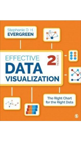
Effective Data Visualization: The Right Chart for the Right Data
297.00 ₪
ISBN13
9781544350882
יצא לאור ב
Thousand Oaks
מהדורה
2nd Revised edition
עמודים
352
פורמט
Paperback / softback
תאריך יציאה לאור
27 במאי 2019
מחליף את פריט
9781506303055
The updated Second Edition of the comprehensive how-to guide functions as a set of blueprints, supported by research and the author’s extensive experience with clients in industries all over the world, for conveying data in an impactful way.
Students and researchers across the social sciences
| מהדורה | 2nd Revised edition |
|---|---|
| עמודים | 352 |
| מחליף את פריט | 9781506303055 |
| פורמט | Paperback / softback |
| ISBN10 | 1544350880 |
| יצא לאור ב | Thousand Oaks |
| תאריך יציאה לאור | 27 במאי 2019 |
| תוכן עניינים | PREFACE ACKNOWLEDGMENTS ABOUT THE AUTHOR Chapter 1. Our Backbone: Why We Visualize Why We Visualize When Visualization Is Harmful Which Chart Type Is Best? Tell a Story With Data How to Use This Book Exercises Resources References Chapter 2. When a Single Number Is Important: Showing Mean, Frequency, and Measures of Variability What Stories Can Be Told With a Single Number? How Can I Visualize a Single Number? How Can I Show Measures of Variability? Exercises Resources References Chapter 3. How Two or More Numbers Are Alike or Different: Visualizing Comparisons What Stories Can Be Told About How Two or More Numbers Are Alike or Different? How Can I Visualize How Two or More Numbers Are Alike or Different? Exercises Resources References Chapter 4. How We Are Better or Worse Than a Benchmark: Displaying Relative Performance What Stories Can Be Told About How We Are Better or Worse Than a Benchmark? How Can I Visualize How We Are Better or Worse Than a Benchmark? Exercises Resources References Chapter 5. What the Survey Says: Showing Likert, Ranking, Check-All-That-Apply, and More What Stories Can Be Told About What the Survey Says? How Can I Visualize What the Survey Says? Ranking Branching Visualizing Not Applicable or Missing Data Exercises Resources References Chapter 6. When There Are Parts of a Whole: Visualizing Beyond the Pie Chart What Stories Can Be Told When There Are Parts of a Whole? How Can I Visualize the Parts of a Whole? Exercises Resources References Chapter 7. How This Thing Changes When That Thing Does: Communicating Correlation and Regression What Stories Can Be Told About How This Thing Changes When That Thing Does? How Can I Visualize How This Thing Changes When That Thing Does? Exercises Resources References Chapter 8. When the Words Have the Meaning: Visualizing Qualitative Data What Stories Can Be Told When the Words Have the Meaning? How Can I Visualize When the Words Have the Meaning? Pure Qualitative: Highlight a Word Pure Qualitative: Thematic Analysis Some Quantification: Highlight a Word Some Quantification: Thematic Analysis Exercises Resources References Chapter 9. How Things Changed Over Time: Depicting Trends What Stories Can Be Told About How Things Changed Over Time? How Can I Visualize How Things Changed Over Time? Exercises Resources References Chapter 10. Reporting Out: Sharing Your Data With the World Static Visuals Interactive Dashboards Exercises Resources References Chapter 11. It's About More Than the Buttons Dot Plots Generate Healthcare Pioneers Clearly Labeled Line Graphs Streamline Decisions at a Fortune 500 Diverging Stacked Bars Make for Community Leaders in the Midwest Icons Support Informed Policymaking Building a Culture of Effective Data Visualization Exercises Resources References INDEX |


Login and Registration Form